
Learn how to create a popup that actually gets your website visitors to convert. Read on, and watch that number of Newsletter subscribers soar.
Business owners daydream about their website visitors converting on a daily basis with minimum to no time passing between purchases. This, however, is unrealistic.
Unless you are selling basic necessities such as food, people will likely dwell on their decisions to buy a certain item. They will compare you to your competitors, and measure the pros and cons of spending their money. Moreover, even if they do, for instance, buy a sweater from your store, they might start their search from scratch the next time they need one. Building brand loyalty, after all, is no easy task.
This is why many businesses create Newsletters. It’s the best way to keep the lines of communication open on a regular basis, which helps brands maintain contact with prospects and past clients.
Check out the text below to find out how you can benefit from marketing a Newsletter on your website quickly and effectively!
What Makes On-Site Newsletter Subscription Campaigns Work?
If you want to turn a casual website visitor into a Newsletter subscriber, you need to know how to push just the right buttons. After all, it’s up to every company to design and write up its own Newsletter content. And the goal is always to provide value, and answer its target audience’s common wants and needs.
Depending on the capacities of your business, you might be looking at weekly newsletters, or a monthly newsletter. You could even set up the ambitious expectation of a daily newsletter email!
A business selling curated artwork might want to share the latest news from the art world, keeping its subscribers ahead of the curve! A weekly Newsletter could cover carefully selected works of contemporary art, as well as novel interpretations of iconic and historical pieces. Even an art course, bringing out the creativity in all of us could be included.
Regardless of the subject line, here are some common denominators a fabulous email Newsletter subscription should contain:
Concise and informative title: Introduce the Newsletter in the headline and aim for clarity. Mention the top benefit in the subheading. Focus on what the subscribers can hope to learn from the Newsletter.
The benefits might include being the first to find out about new collections or discounts. In other cases, the Newsletter could be more informative, offering information on the latest industry trends.
Clear CTA: The call to action is arguably the most important part of your design and content/copy planning, as it is supposed to get the target audience to take the desired action. A simple "Subscribe," "Subscribe Here," or "Submit" would do. Simplicity is the priority here, and there's no need to waste your time on trying to be too creative.
Complementing the UX: It's of vital importance for any on-site marketing campaign to appear at the right time. The idea is not to interrupt the overall user experience but to complement and enrich it.
Do not offer a newsletter immediately upon entrance. Wait for the user to spend some time on the website first and show interest: even if it's just a few seconds. You can set up smart marketing campaigns on your website with precise user behavior prompts such as timers, that make your campaign appear exactly when and where you want.
Mobile responsiveness: More and more individuals browse their email on mobile devices. For the best results, businesses must make sure their newsletters are adapted for smartphones.
According to Statista, as much as 58.99% of global website traffic came from mobile devices (minus tablets) in Q2 of 2022.
Newsletter Signup Examples
The best newsletter emails out there started out as clickable marketing campaigns on someone’s website.
And when it comes to drawing in subscribers, everything matters; the exact shade of red in your campaign design, the moment the popup appears to users, and even the precise wording of your headline.
We’ve singled out some smashing newsletter subscription form examples to show you what we mean.
Check out what this art gallery website’s invitation to subscribe to newsletter emails looks like:

You can find the email newsletter sign up above on the Widewalls website, one of the top 10 art online resources and marketplaces in the world.
The vivacious, swirly colors of the image are pleasing to the eyes, as much as they are attention-grabbing. The fuchsia CTA button matches the X button on the upper right corner of the popup, as well as other website CTAs, such as login. The overall newsletter subscription message is even more striking with the darkened overlay.
Finally, the generous spacing between letters and the website-popup font consistency reveal a uniformity of the brand voice.
To see a more toned-down, but just an effective eNewsletter subscription campaign, check out the example below:

Similarly to Widewalls, this newsletter subscription popup only requires you to fill in your email information. Everything else is different, including the image location, overall simplicity, and even language. And yet, the subscription-generating marketing campaign again succeeds in drawing attention without standing out.
Foxhome’s minimalist website is filled with earthy color tones and pics of natural materials such as wood, wax, clay, and porcelain. The low-contrast color palette and original, high-quality photographs all come together to increase the list of subscribers.
The following example shows a smart newsletter campaign in the fashion industry. Just like Widewalls and Foxhome, the popup fits the website like a glove:
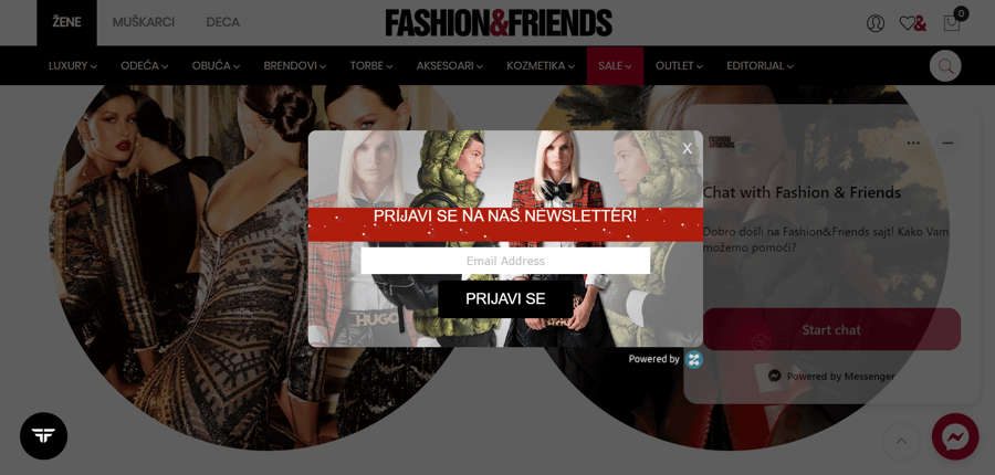 Image 3: fashion newsletter example
Fashion&Friends offers its prospects and customers a free newsletter subscription covering news, discounts, and updates on dozens of leading brands in the fashion world. Some of the big names that chose to sell via F&f include Diesel, Levi’s, Calvin Klein, and Hugo Boss.
As evidenced by the image above, the color palette is simple, highly contrasted combo of black, white and red. This simple design allows the eye to easily settle on the high-resolution, professional photographs, flaunting the luxury apparel on stunning models.
The way that the pop up newsletter subscription form appears to users is similarly mindful and subtle; the marketing campaign appears when a website visitor is about to leave. On desktop, the popup appears as soon as a user hovers over the X button. On mobile devices, on the other hand, the exit intent is displayed by scrolling up.
How the Best Newsletters Work Smart and Hard
Smart newsletter subscription campaigns can do wonders for generating leads on your website. The three examples you had a chance to see in this article have all been built using Zoom Engage, a campaign-building platform.
You can do everything from popup design to personalization and making sure each campaign matches a client's unique brand voice in the same place.
Check out the image below, for a display of what the ZE interface looks like.
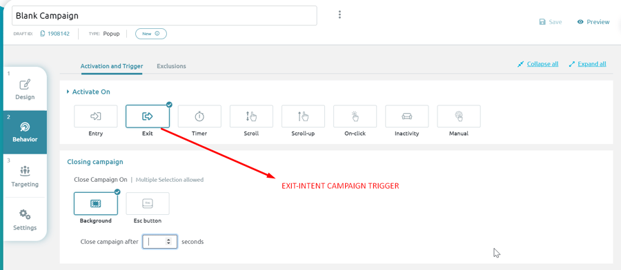 Image 4: Zoom Engage Interface
As you can see, a user can choose to exit, or while scrolling up or down. Every user behavior, including inactivity, means something to an experienced marketer.
Calibrating your on-site marketing campaigns in such detail results in higher conversion rates, and a smoother, enriched customer experience. Smart popups treat every website visitor as an individual, and can make sure hundreds, thousands, and even hundreds of thousands of people get special treatment.