Carousel UX Design and Best Practices
Unless you've been living under a rock, the chances are that you've already visited a website featuring some sort of carousel design.
And if you're on social media such as Instagram or Linkedin, you may even have created one yourself, without too much trouble.
If you use the right carousel-building platform, you can steal this visually breathtaking social media look for your website, with little to no coding knowledge. Get those fabulous pics in line and inspire your website visitors to convert.
But, you need to be careful about it. In the text below, we will warn you about some perils and difficulties you may encounter on your way to creating your own perfect carousels.
Read on and find out how you can maximize the potential of carousel website design, with a list of the best practices. That's without risking bad UX design.
Carousels vs. Sliders
Before getting down to the nitty-gritty of good UX design, it’s important to highlight the difference between carousels and sliders.
It’s not a huge deal: carousels refer to image galleries in which two or more pics are visible at once. A carousel might contain 9 pics total, with you being able to see three at a time.
On the other hand, sliders only allow users to see one image before sliding away toward the others. An image slider is often less imposing than its counterpart, which is why it's used for different purposes.
Both are creative ways to present online content, but you are more likely to get away with not minimizing an image slider without impacting your UX, for instance.
Carousel UX Design
Making sure that both your user experience (UX) and user interface (UI) are flawless should be the priority for any business owner with a carousel on their website.
Carousel UX design has to do with any interaction a prospect or a customer might have with your company. The chief goal is efficiency.
The aspects of website carousel designs include:
- Multiple high-quality images.
- Videos.
- CTA buttons.
- Text, including prices and/or product descriptions.
- Focus on functionality and efficiency.
- Structural design solutions.
It’s not so much about visuals; a well-planned carousel UX design is supposed to optimize the user's overall interaction with the brand. Carousel UX is chiefly focused on not losing customers.
One example of UX carousel design is making sure your carousel is manually controlled or at least slow-paced, to avoid banner blindness. If the pics on your carousel slide too quickly, your users’ eyes might interpret them as ads and, either on purpose or by accident, filter them out of your mind.
Carousel UI Design
A successful slider UI or carousel UI design implies making a strong, favorable visual and aesthetic impression. Additionally, you should aim to create an intuitive user interface.
While UX still needs to be impeccable, an appropriate user interface design (UI) prioritizes beauty and ease while interacting with your website. And carousels can assist your UI efforts on any website page, primarily the Home Page.
Requiring many more creative skills than UX, user interaction includes the following:
- Elegant, context-appropriate typography.
- A unique brand color palette.
- Visually distinct CTA buttons and carousel designs that match the brand colors.
- Unique animations and imagery that help your carousel stand out
- An inclination to make impressive and stylish design choices
- combinations of typography and carefully selected color palettes.
How to Do Both Well: The Best Carousel Design Practices
Okay, so now you know what UX and UI design stand for, and what you should do to make them work. But how do you even go about doing that?
In the text below, we will list some common mistakes you should avoid if you plan on using website carousels to turn a profit.
But first, you need to discover whether or not your carousel idea passes the litmus test for both usability and visual appeal. Here are 6 things you need to do if you want to ensure a smooth and profitable website design. Read on and find out how to keep your slider UX, and/or slider UI up to date and fabulous.
1. If You Autoplay, Keep it Smooth and Slow
Sure, your website's carousels are supposed to move on their own and it's come to be expected. If you adjust the sliding speed without regard for your users' perception, however, you'll end up with high bounce rates. Somehow, an analogy with an actual carousel spinning too quickly and having people fall off works for this scenario.
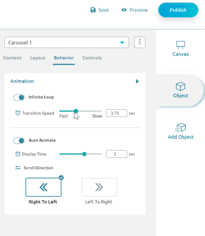
 Image 1: Carousel Speed Adjustment via Zoom Engage
To minimize the potential damages, make sure your carousel moves slowly, when on autoplay. On the Zoom Engage platform, you can easily adjust the speed of the image slider.
2. Keep your Carousels Interactive and Your Users in Control
The slideshow can move automatically, or it could require manual navigation. It's also possible to offer both options. Keep in mind though, that users have grown used to having a modicum of control over various interfaces. Staying in control of the navigation is a prerequisite to sound UX design, according to your audiences.
You don’t want your customers to hunt through the carousel for the shopping button. Otherwise, you could end up overwhelming the user, and making them feel frustrated. One other option, of course, would be to make the sliding process manual. In that case, customers would be the ones in control.
3. Navigation Rules and Issues
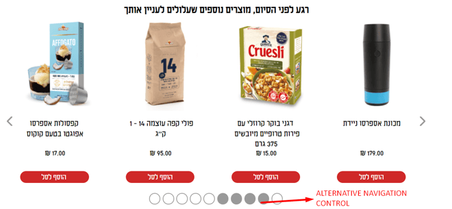
Below every piece of content on your carousel, there is a feature meant to help users out with navigation. This feature can take many forms: usually, it's filled with hollow circles, numbers, or miniature representations of carousel images.
 Image 2: Carousel Navigation Options
Either way, it's supposed to map out your swiping journey by highlighting the visible slides. Other than clicking the arrows on the left and the right of the carousel, the user can also click the hollow circles and move to the corresponding slide.
4. Keep the Text Short and Clear
You are going to have to be the guinea pig for this one. If you can register the pics, the CTA buttons, and the text in your carousel before the slide moves on – it's short enough.
If you're not 100% sure you can do it easily, you need to dial down that slide transition speed. Alternatively, you can just forget all about auto sliding and leave it up to your users to navigate the carousel at will. Still, you are going to want to keep the text short and sweet, for aesthetic reasons.
5. Don’t Duplicate H1 Tags
If you're using text in your carousel, there's a risk of inserting H1 tags by mistake. This would be a terrible idea, as it would be detrimental to your website's SEO. Namely, Google treats the H1 tag as a title. Since the topic of your home page might not be flamin' hot Cheetos, you might want to reconsider. You should aim for one main H1 topic per page where applicable, a topic that has to do with more relevant content.
Make sure to check for any loose H1 tags in your carousel text, and replace them with normal text, or H2, H3, H4 tags, etc.
6. Make Sure Your Carousel Is Responsive, Mobile-Friendly, and Touch-Friendly
When checking for a mobile-friendly carousel design, you can adjust all of the specific design solutions in the ZE platform.
The one thing you absolutely have to do is make your carousel design responsive. Finding that little arrow to swipe left or right can be tricky on smaller, smartphone screens. This is why you should follow Tinder's UX advice and enable swiping the pics left or right with ease.
Final Words
Now that you know exactly how not to mess up your carousel design, ask yourself one more question: Why do I need it?
If you plan on using your carousel as a dumping ground for leftover content, you can kiss this whole thing goodbye.
Build a marketing plan, and use the carousel only for meaningful and practical purposes. Launching a new product line, offering seasonal discounts, and showing off your product in different colors and sizes are just some ideas.
And that's it. Check out our Zoom Engage Carousel Guide if you want to learn how to build a carousel by yourself using simple drag-and-drop commands. Good luck!
